My Role: Graphic Design • Illustration • Typography Design
The Proposal
AI Forge's promotion began with a request for die-cut decals that would promote a cool and edgy approach while utilizing their brand colors and website. I would use Adobe Illustrator as the primary illustration tool for this project.
Phases Of The Design
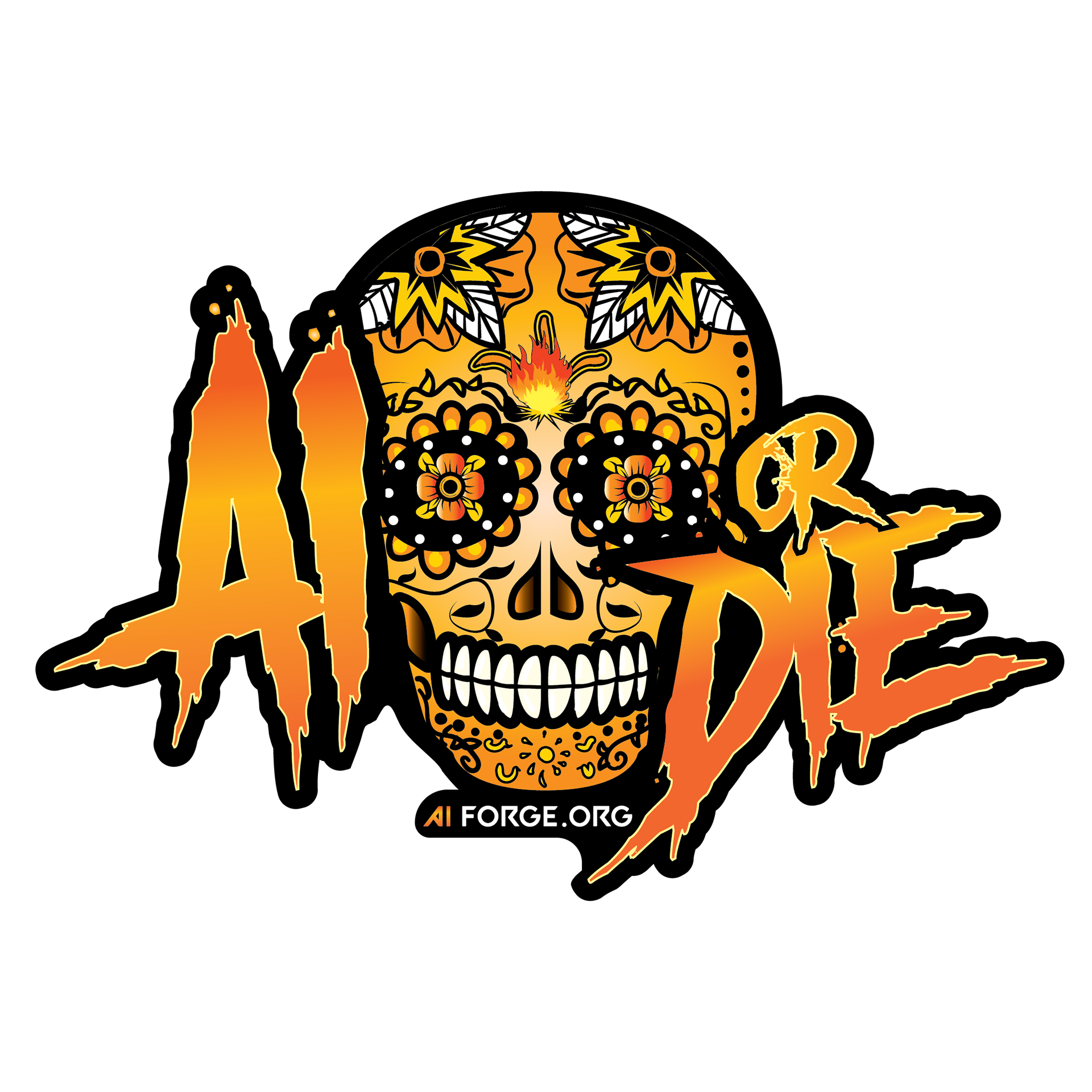
First Design Proof
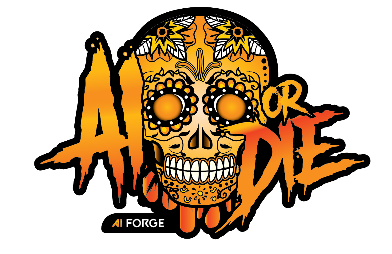
Second Design Proof
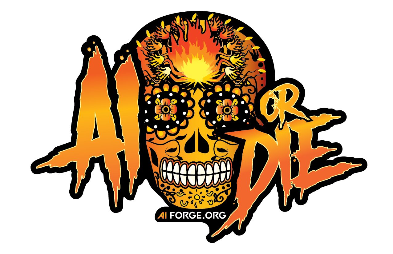
The first proof of the illustration focused on a Día de los Muertos design with a horror themed font. I stuck to their "AI" logo gradient for the color palette. Alas, the second proof would go on to focus on the "Forge" part of the company name. Forge, by definition, is to create using heat and fire. Which inclined me to incorporate flames into the design. Requirements of the design included:
• Company Color Palette
• Include Company Website
• Die-Cut Decal Design
Adobe Illustrator
Color Is Key
The font needed to be edgy and cool, but also legible. I found that the dripping effects of Another Danger Font really went with the flow of the skull's design.
To enhance and separate the lettering from the skull, I created a glow of yellow within the gradient of the text, as well as adding a solid shadow outline of black to make the text pop.
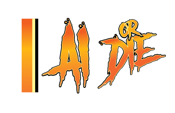
Keeping the AI Forge logo color palette was important to the overall design of the decal.